Two frictions, one game.
A speculative UX rework of two pain points in TOTK — a flat inventory that doesn't scale, and an armour upgrade flow that never learned to batch. Same root cause, two different surfaces.
One playthrough, two observations.
This project started mid-playthrough, around hour forty. Two things kept breaking flow: finding the right material in a grid that doesn't organise itself, and upgrading three armour pieces when the Great Fairy only works one at a time.
Two separate problems. The same root: the UI treats the player's collection as storage, not as a decision-making surface. The inventory groups are for the moment before crafting — "what do I have?" The batch upgrade is for the moment at the Fairy — "now let me use it all at once."
The Inventory.
A grid that forgot to grow.
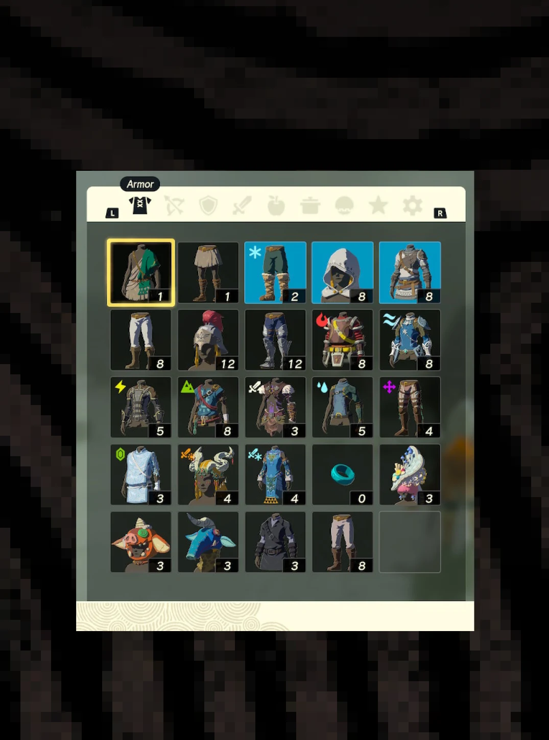
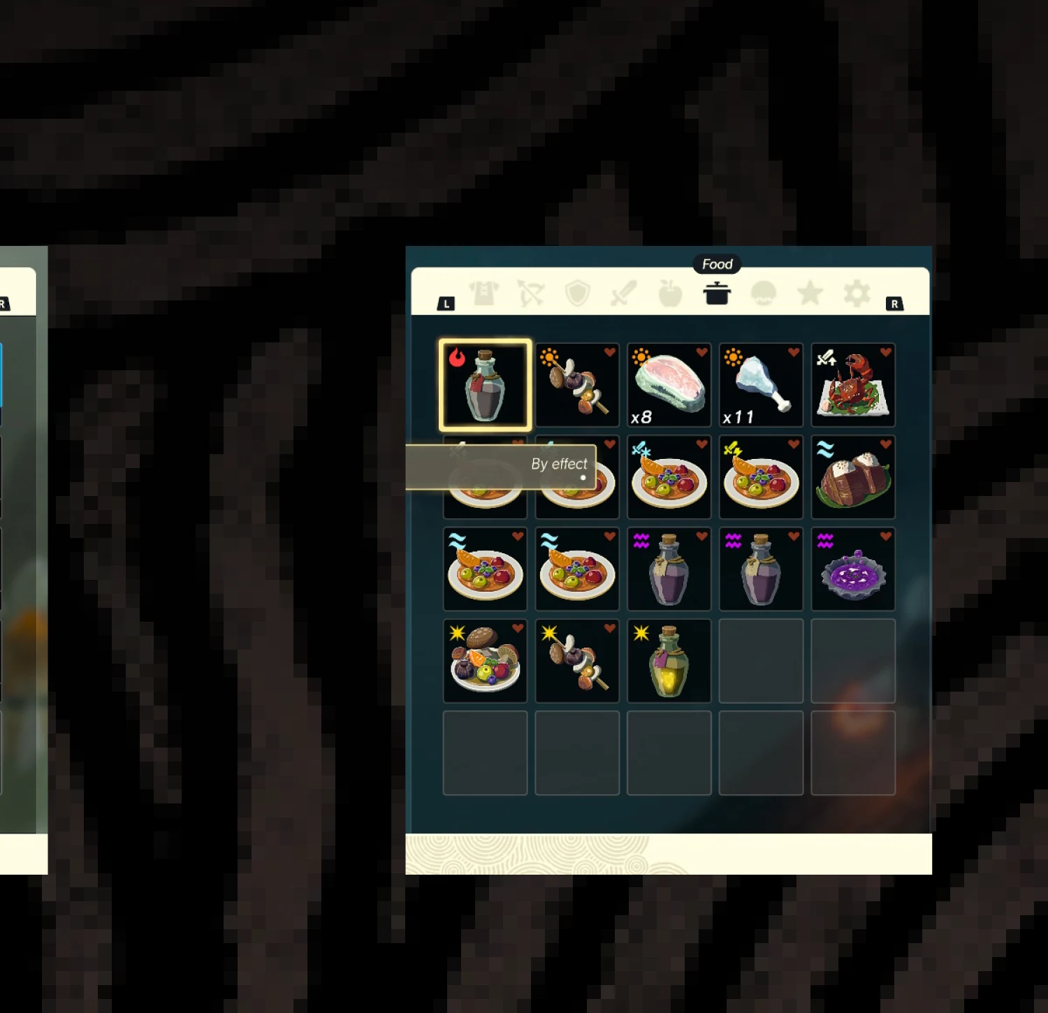
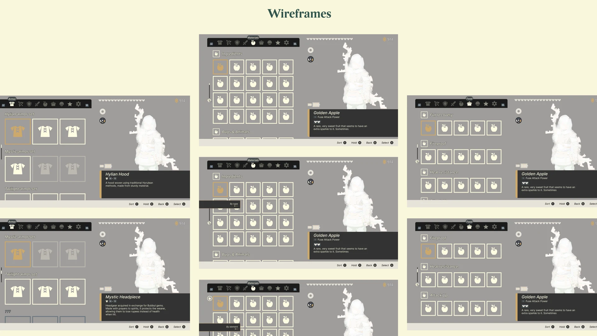
The inventory is one unbroken grid per tab. Materials, Armour, Food — each gets a flat scroll with no internal structure. Early in the game that's workable. By hour forty, when you're carrying 107 Brightbloom Seeds, 54 Sunset Fireflies, 43 Fire Keeses and a full set of mismatched armour, findable means memorised location.
Sort options exist — by type, by effect — but they produce a reordered flat list, not a structured one. You still can't tell at a glance that three gear pieces form a set, or that twelve of your ingredients share a trait you'll need at the next upgrade.
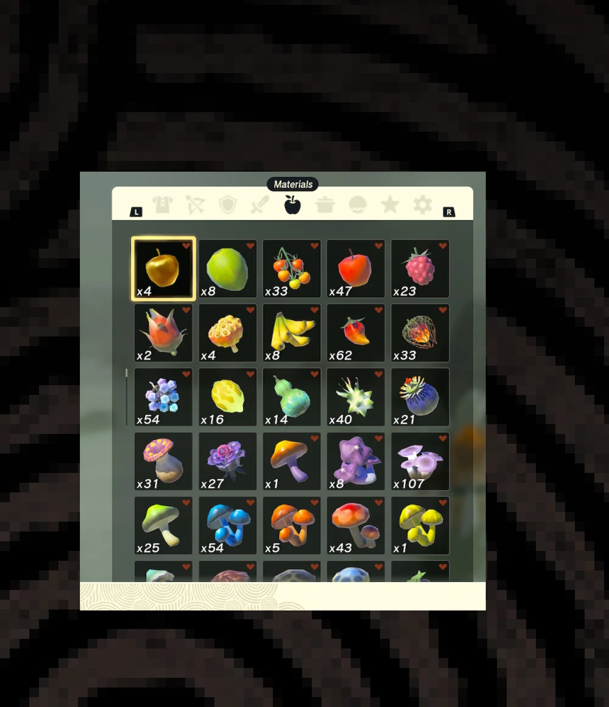
Sort changes order. Groups change understanding.
The fix wasn't a new tab or a new screen. It was a grouping layer — one collapsible group header per logical category, with an item count — applied consistently across all three tabs.
Each tab gets its own grouping logic, matching the mental model players already bring when they open it:
- Materials → by ingredient family (Ingredients · Bugs & Animals · Ore · Monster Parts…)
- Armour → by set (Hylian armor set · Mystic armor set · Twilight armor set…)
- Food → by effect (Full recovery · Fireproof · Heat-resistance · Attack-up…)
The sort options still work inside each group. The detail pane on the right is untouched. No new input required.
The group header says what the player already knows.
Three panels, three logics.
Each panel shows the same layout: collapsible group header, items beneath it, existing detail pane on the right. The only new element is the group row — everything else is Nintendo's original design untouched.
The Armour tab is the most impactful change: for the first time the game surface tells you that three pieces of gear belong together as a set — useful precisely when you're deciding which pieces to take to the Great Fairy.
The Great Fairy.
Three taps for one upgrade.
Upgrading armour at the Great Fairy is one of the most repeated micro-tasks in TOTK. Each upgrade is a sequence of five inputs — examine, choose gear, pick three materials, confirm, watch animation — done once per level, per piece.
Want to level one piece three times? You repeat the whole thing three times. Want to level three different pieces? Same. The UI doesn't know you came here for a batch.
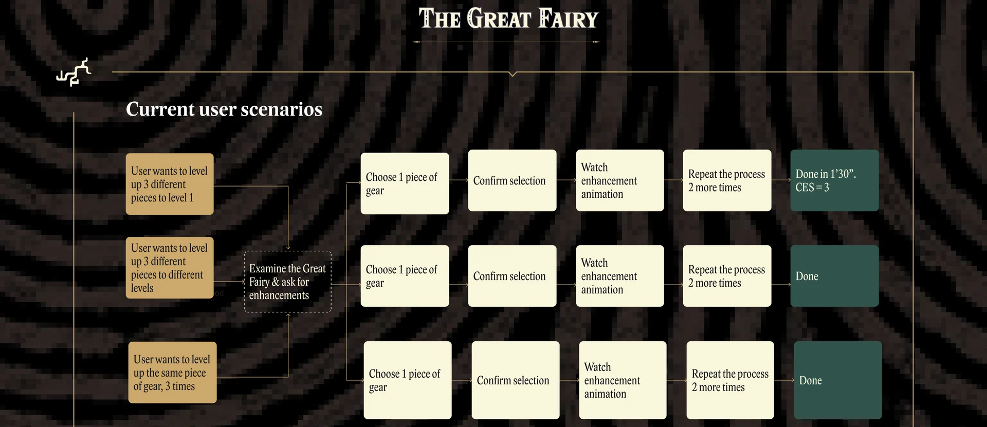
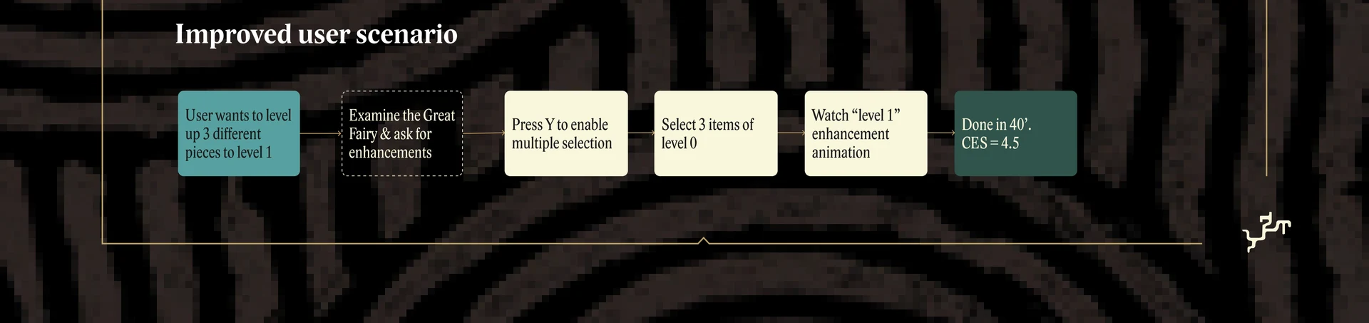
What if a single key meant batch?
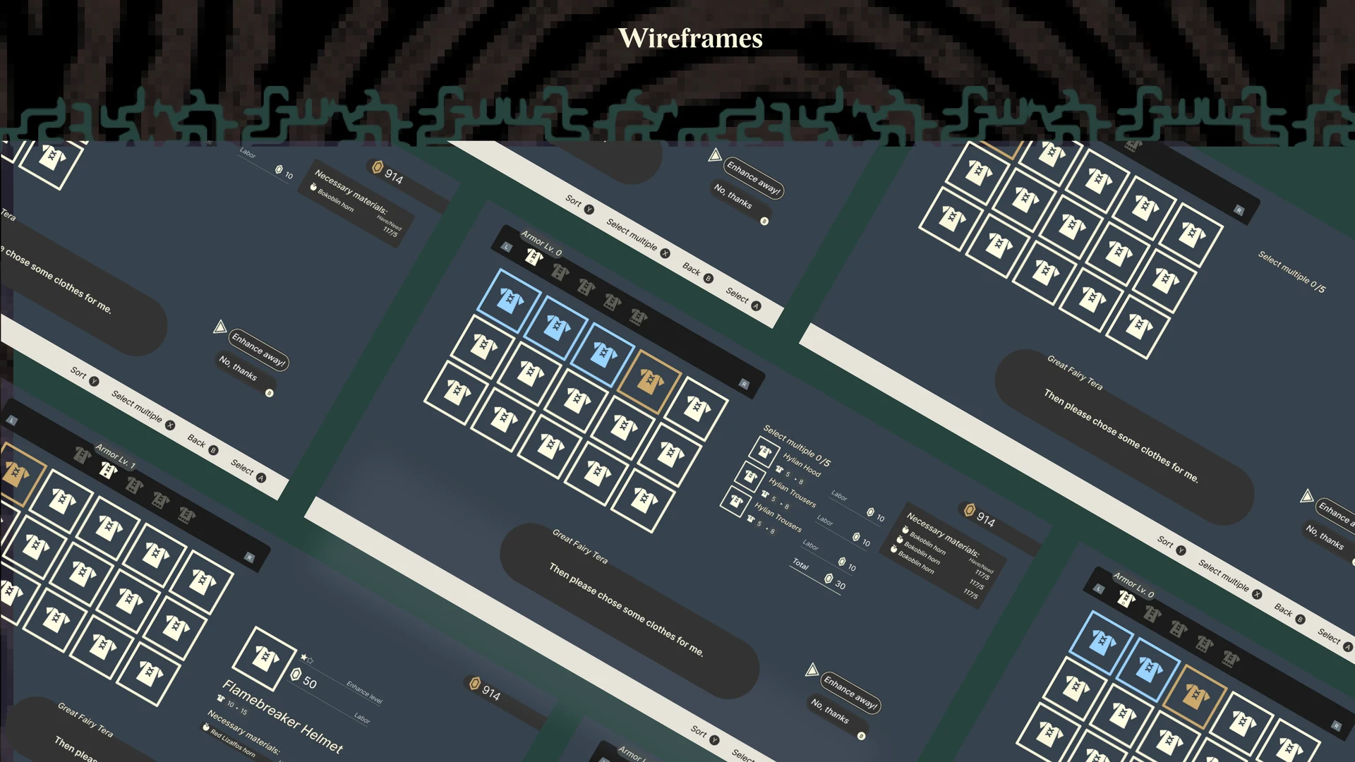
The fix didn't need a new screen, a new menu, or a new button on the gamepad. It needed one re-purposed input: press Y on the gear list to enter multi-select mode.
The rest of the flow stays exactly as Nintendo designed it — same materials grid, same confirmation, same upgrade animation — only now operating on a list instead of an item. This is also where the Armour tab grouping from Intervention 01 pays off: you can arrive at the Fairy knowing exactly which set you want to upgrade next.
Same flow, batched. Same animation, looped.
The improved path.
Seven screens. Step 02 is the only new state. Everything downstream falls out naturally — the confirmation screen shows N materials per item, the upgrade animation plays per piece, end card sums the result.
A working rough.
A clickable prototype demonstrates the new selection mode against the original flow. Built in Figma, gated by gamepad inputs. The inventory grouping and the batch upgrade flow are both navigable from the same starting point.
What changed under the timer.
The inventory grouping wasn't timed — its value is qualitative: context is available at the moment you need to make a decision, not buried six scrolls down. The upgrade flow was self-tested with a stopwatch and a Customer Effort Score against two scenarios: level one piece three times, and level three different pieces.