Travel Planner — a reason to come back.
Concierge could hold a conversation, but not your trip. The Travel Planner gives it a memory: save any flight, stay or place — by tapping a card or simply asking — and a scattered trip assembles itself into one plan worth returning to.
A conversation users never came back to.
Planning a trip is complex, asynchronous and scattered: notes in one app, tickets in another, a hotel quote screenshotted in a third. People arrive at the gate already overwhelmed.
Concierge answered questions beautifully — but the moment you closed the chat, everything it found was gone. There was no place to keep things, and so no reason to return. The 7-day return rate sat below target, and the assistant had no unique value to pull anyone back.
A scan of indirect competitors like Kayak.ai exposed the opening: deliver Concierge's promise in one place — turning a smart conversation into a trip you actually own.
Give the conversation a memory, and you give the user a reason to return.
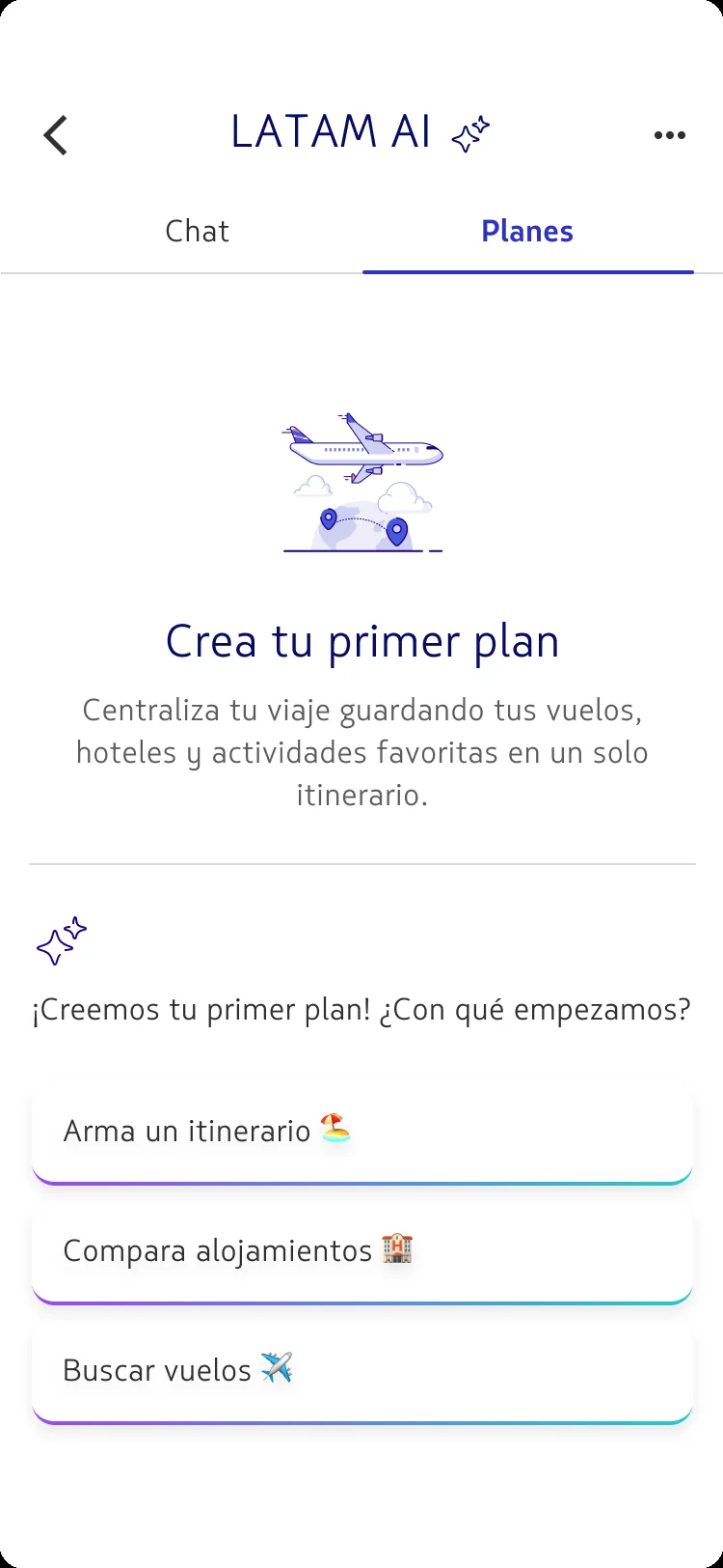
A playlist, for a trip.
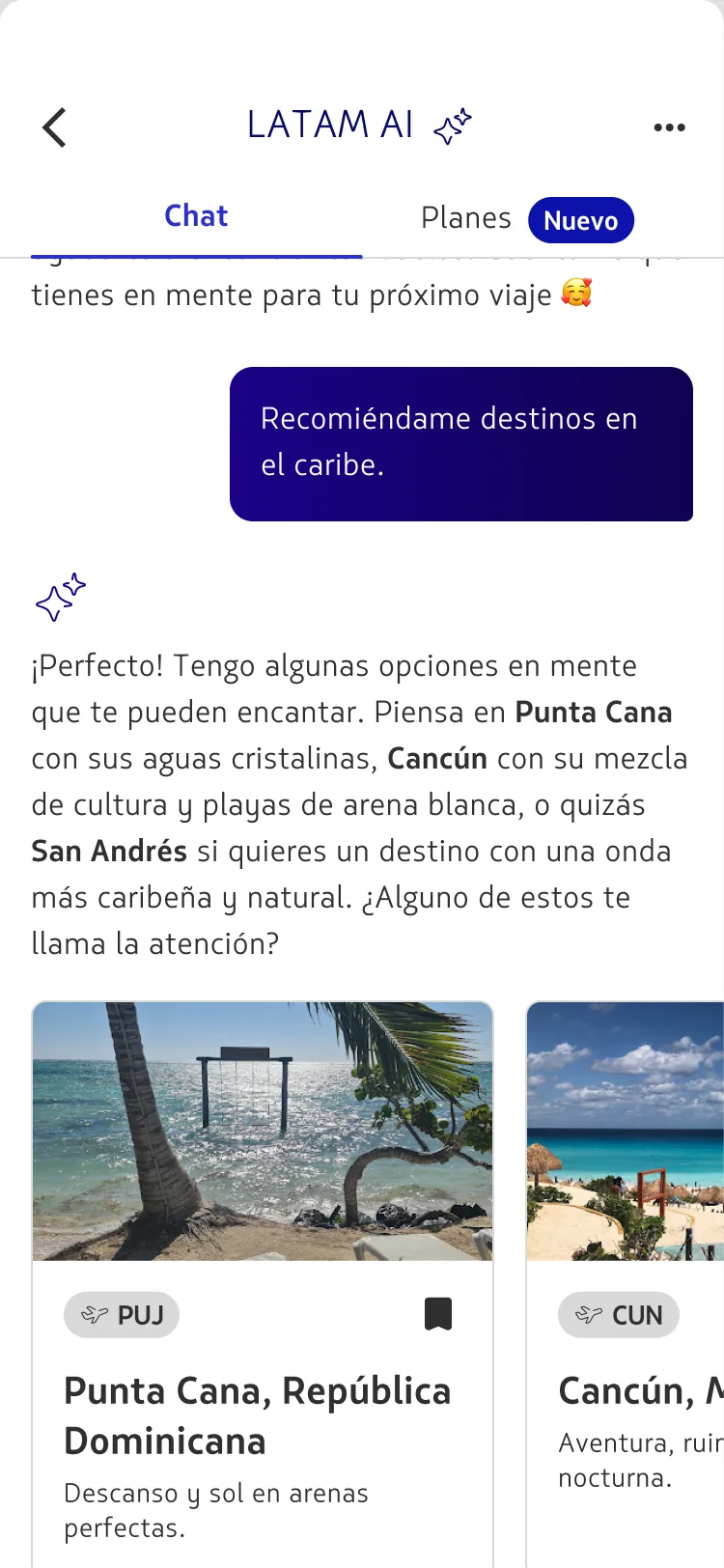
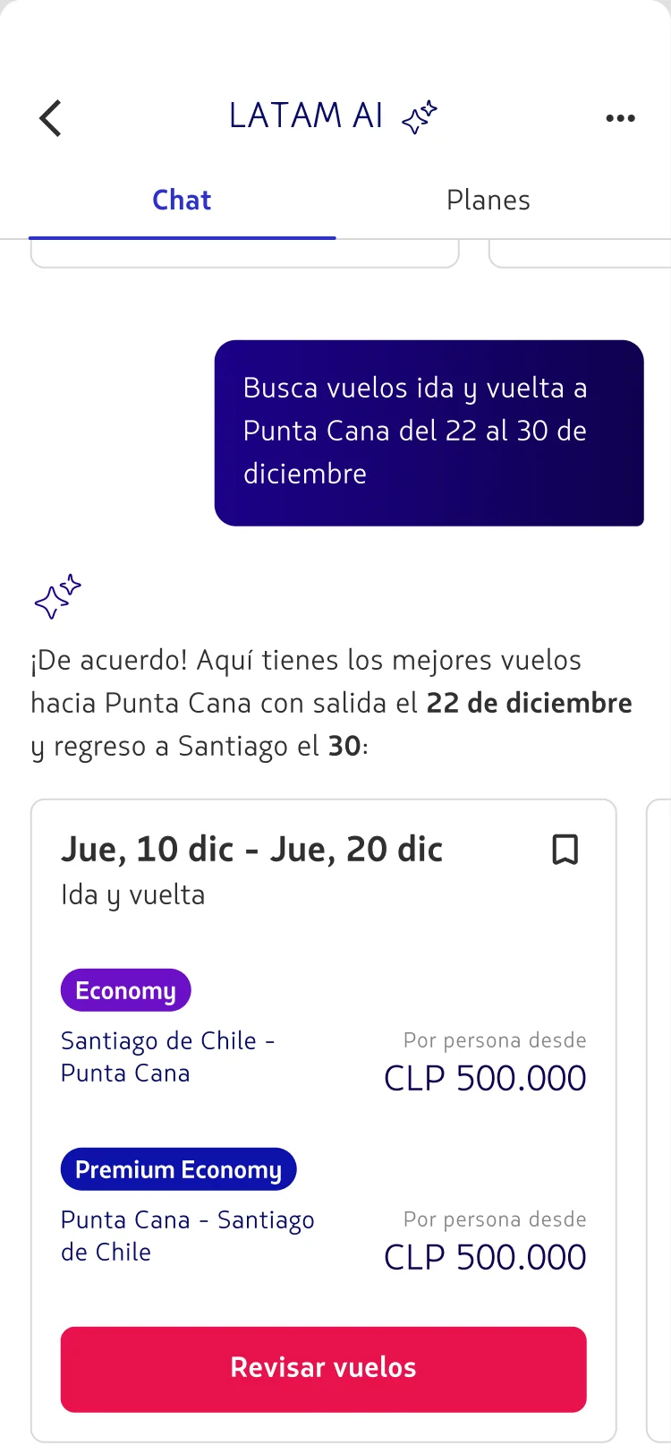
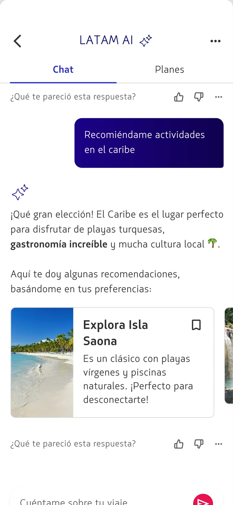
The mental model came from music: saving a recommendation to a trip should feel exactly like adding a song to a playlist. Every flight, hotel, destination and activity Concierge surfaces is a saveable card — bookmark it into a plan and move on.
There are two ways in, and they land in the same place. Tap the save control on a card, or just say it — "guarda ese hotel en mi plan." Concierge's agentic layer performs the save either way, so structured UI and natural language stop competing and start cooperating.
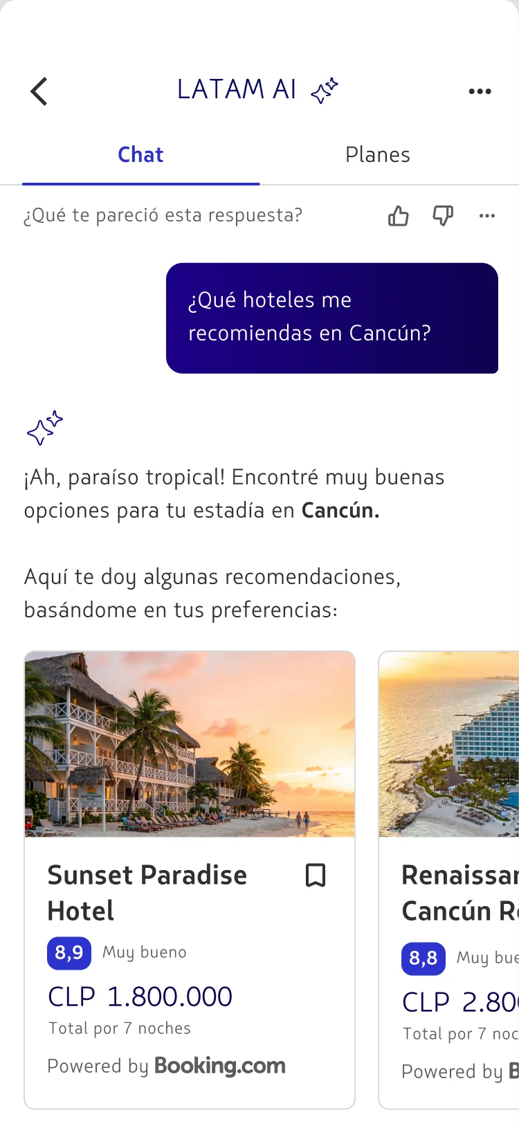
Save it like a song. Tap the card — or just ask.
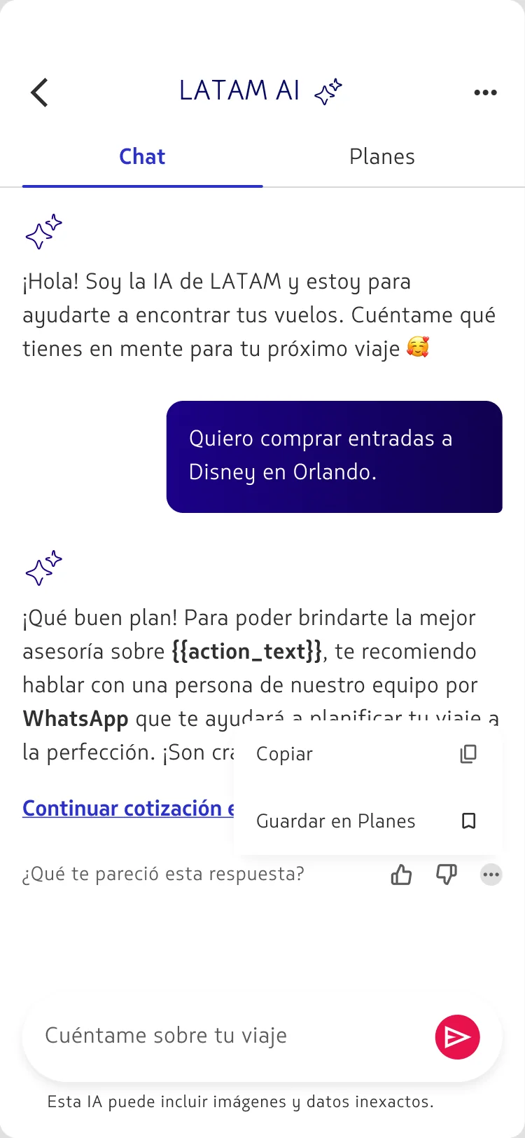
Even a chat answer is worth keeping
Not everything useful is a card. A great reply — an itinerary, a comparison, a tip — can be pinned straight from the conversation into the plan's highlighted messages, so the reasoning behind a decision travels with it.
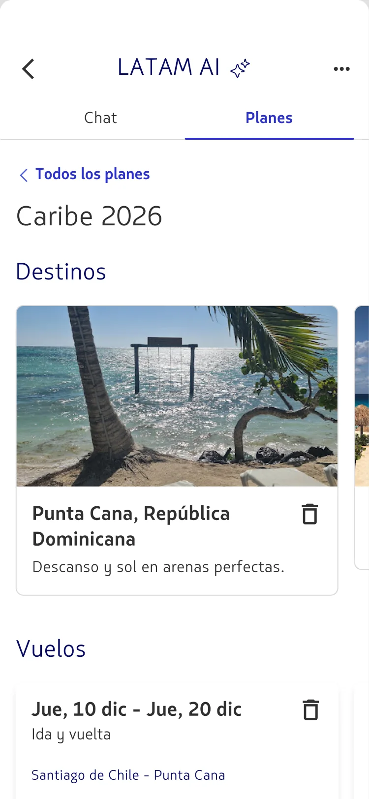
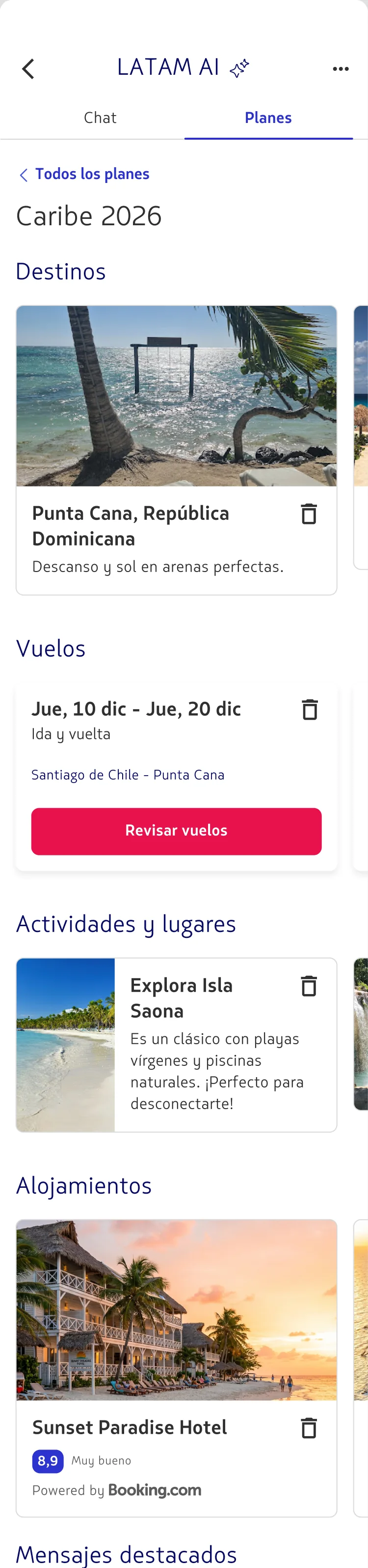
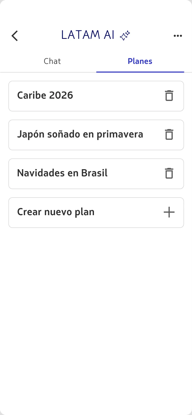
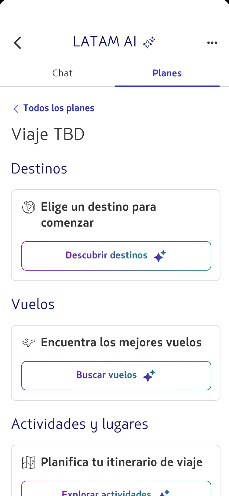
Inside a trip plan.
A plan is a lightweight container — a title, optional dates, and a stream of saved cards grouped by what they are. Whatever Concierge surfaces in chat can be promoted into it with one tap or one sentence, then read back as a single, ordered itinerary.
- 01Title — editable, generated from the first prompt
- 02Dates — optional; the plan reads fine with or without them
- 03Grouped items — destinations · flights · activities · stays
- 04Highlighted messages — chat answers worth keeping
- 05One save path — card tap or prompt, both run the same agentic action
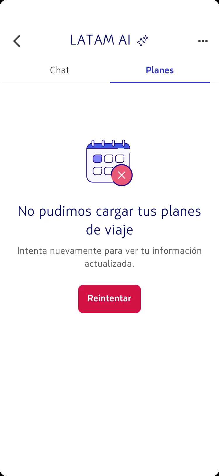
Designed for the edges, not just the happy path
A planner is only trustworthy if it behaves when the data doesn't. I designed the full state matrix alongside the ideal flow — a warm first-run, an empty plan that still tells you what to do next, graceful load failures, and skeleton loaders so nothing ever flashes blank.
Does it bring them back?
Moderated usability testing pointed twice at the same need: users asked for a drag-and-drop calendar and a way to save and share quotes. Both were really one request — give me a container I can come back to. That request shaped the highlighted-messages pattern and the grouped plan.
After two iteration rounds — mostly sharper feedback states and clearer ownership cues — the major usability issues were resolved. Attitudes were positive, and participants named the planning hub itself as the reason they'd return.
A smart answer is a moment. A plan is a reason to return.