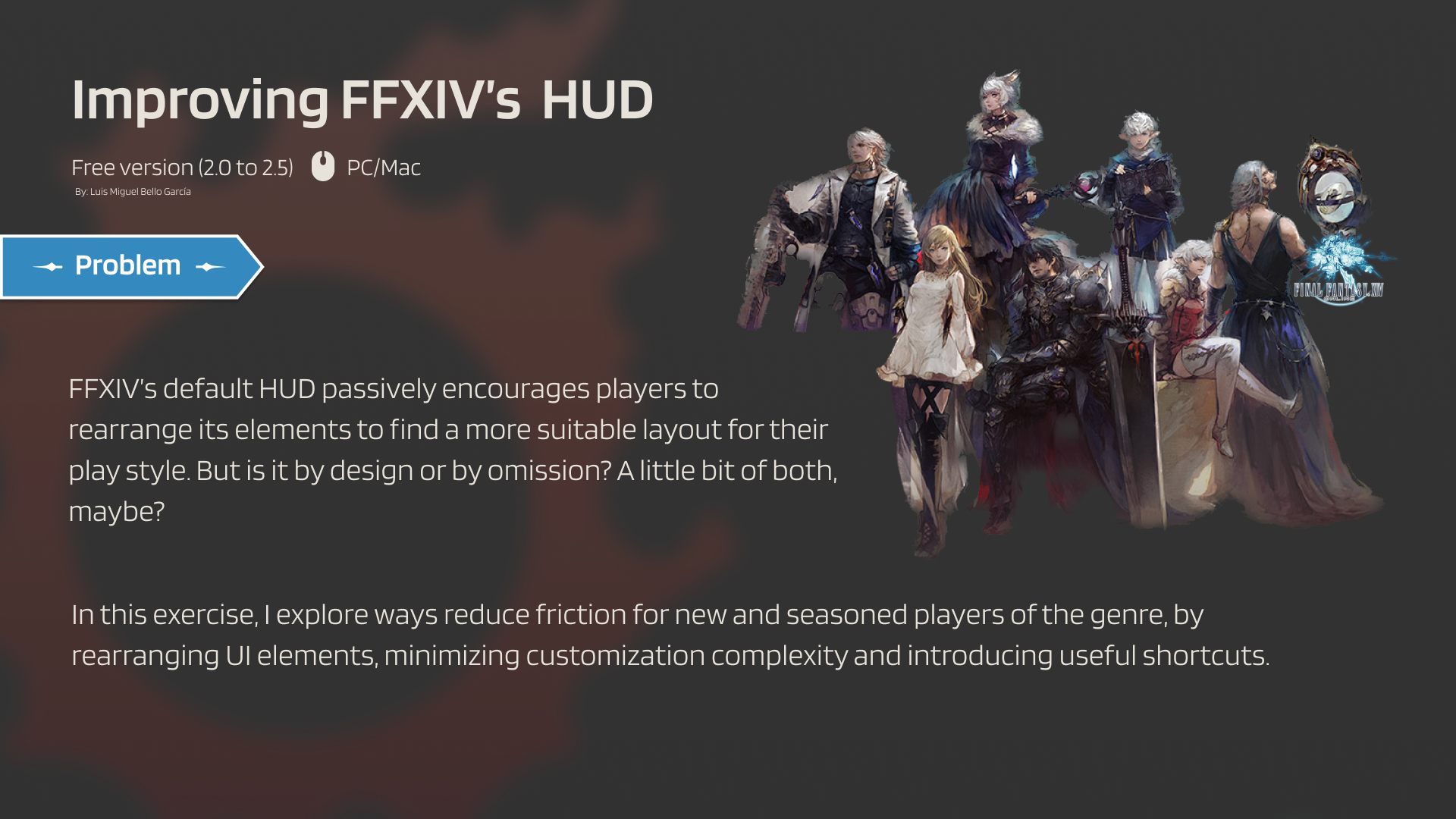
A better default HUD
A heuristic teardown of Final Fantasy XIV's information-dense HUD — and a calmer, more efficient layout.
Too much HUD, too little signal.
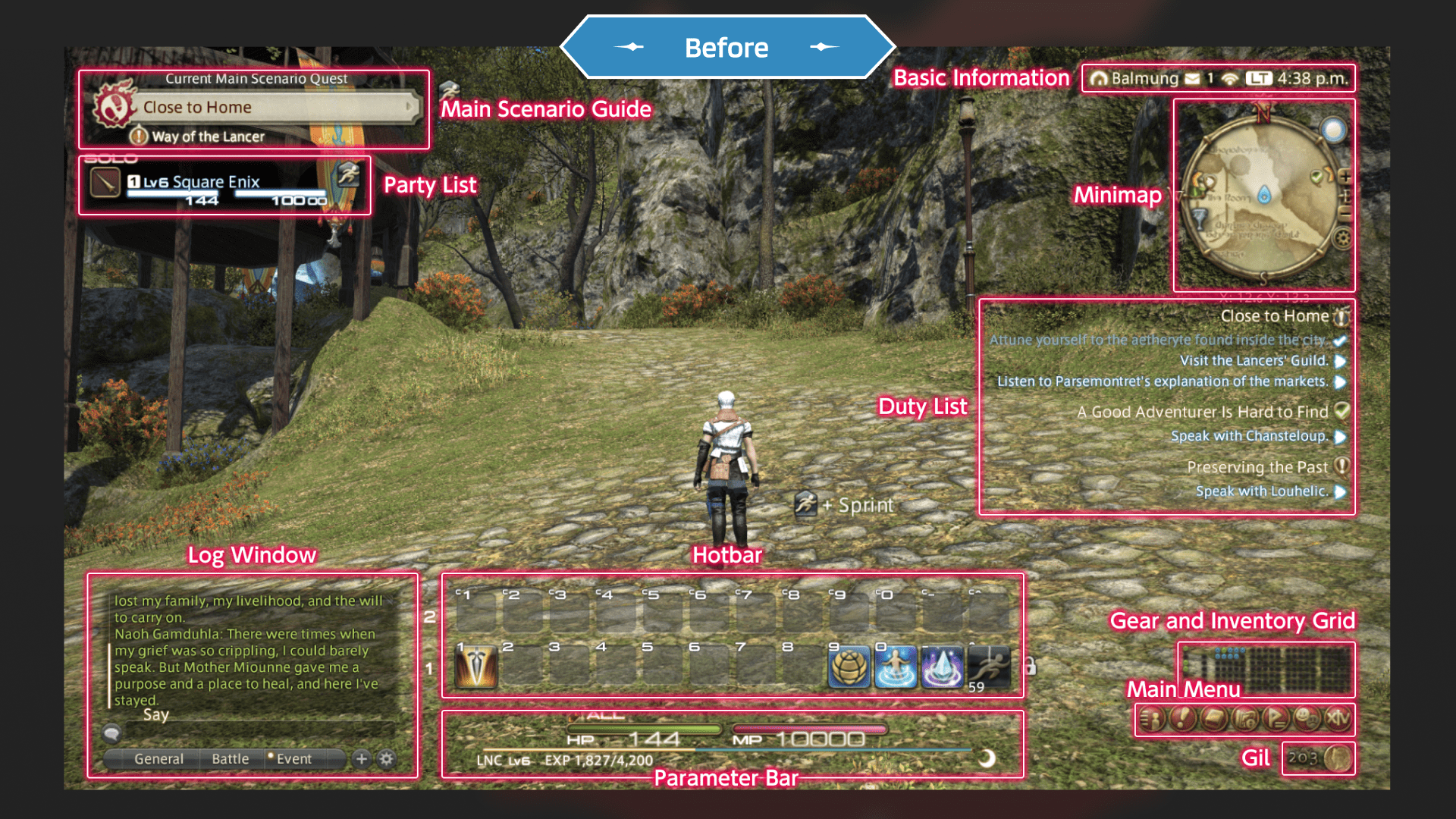
FFXIV's HUD is famously dense. Twelve hotbars. Six log windows. Every element movable. In combat it's a marvel of optimisation — until you need to actually change something mid-fight.
I focused on three elements that directly affect how players perform in combat: customising skill hotbars for cleaner ability management, swapping classes without breaking flow, and tracking quests and missions without losing situational awareness. These aren't quality-of-life edge cases — they're the decisions that shape every encounter, and the stock UI makes each one harder than it needs to be.
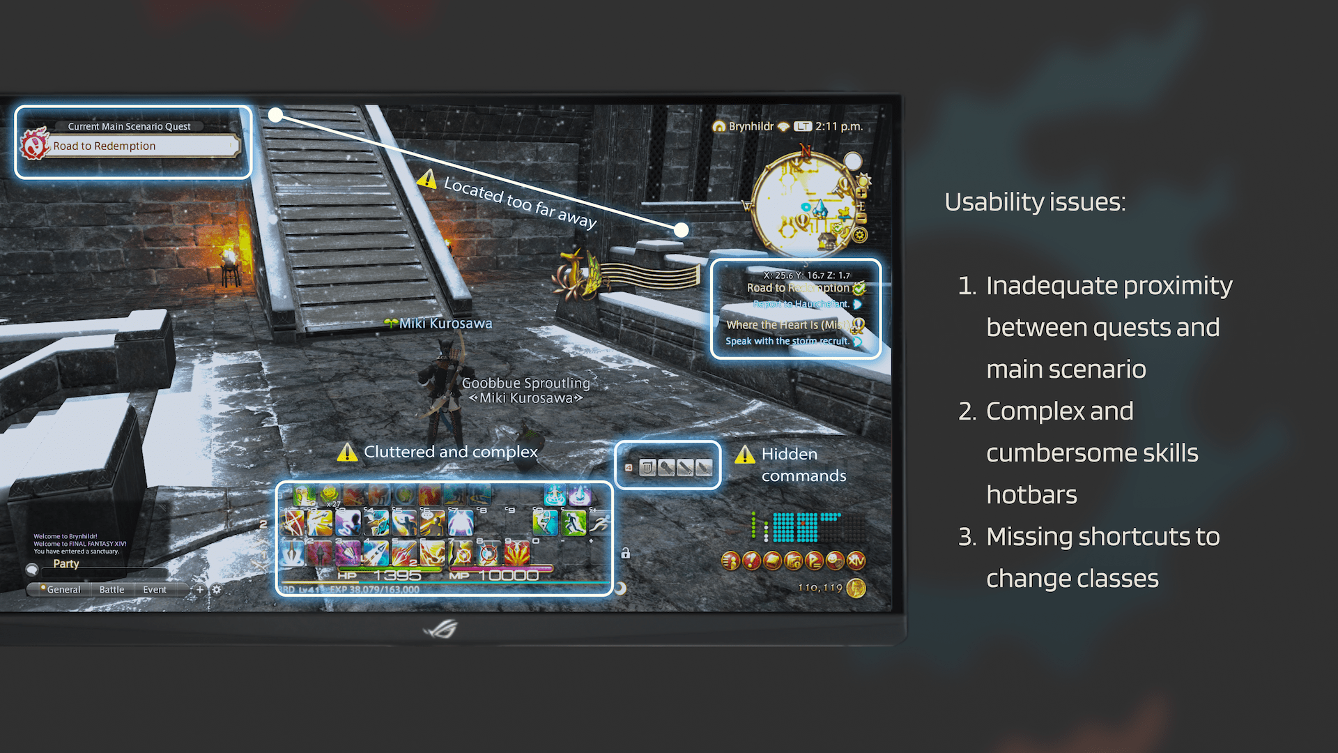
- 01HUD elements — 14 visible · zero priority
- 02Hotbars — up to 12, fully customisable
- 03Quest log — anywhere the player drops it
- 04Class swap — buried in main menu
Seven MMOs, five patterns.
I tore down the out-of-combat HUDs of seven MMOs — Guild Wars 2, FFXV, WoW, Diablo III, The Elder Scrolls Online, Lost Ark, and FFXIV itself — looking for repeated patterns that solved the legibility problem.
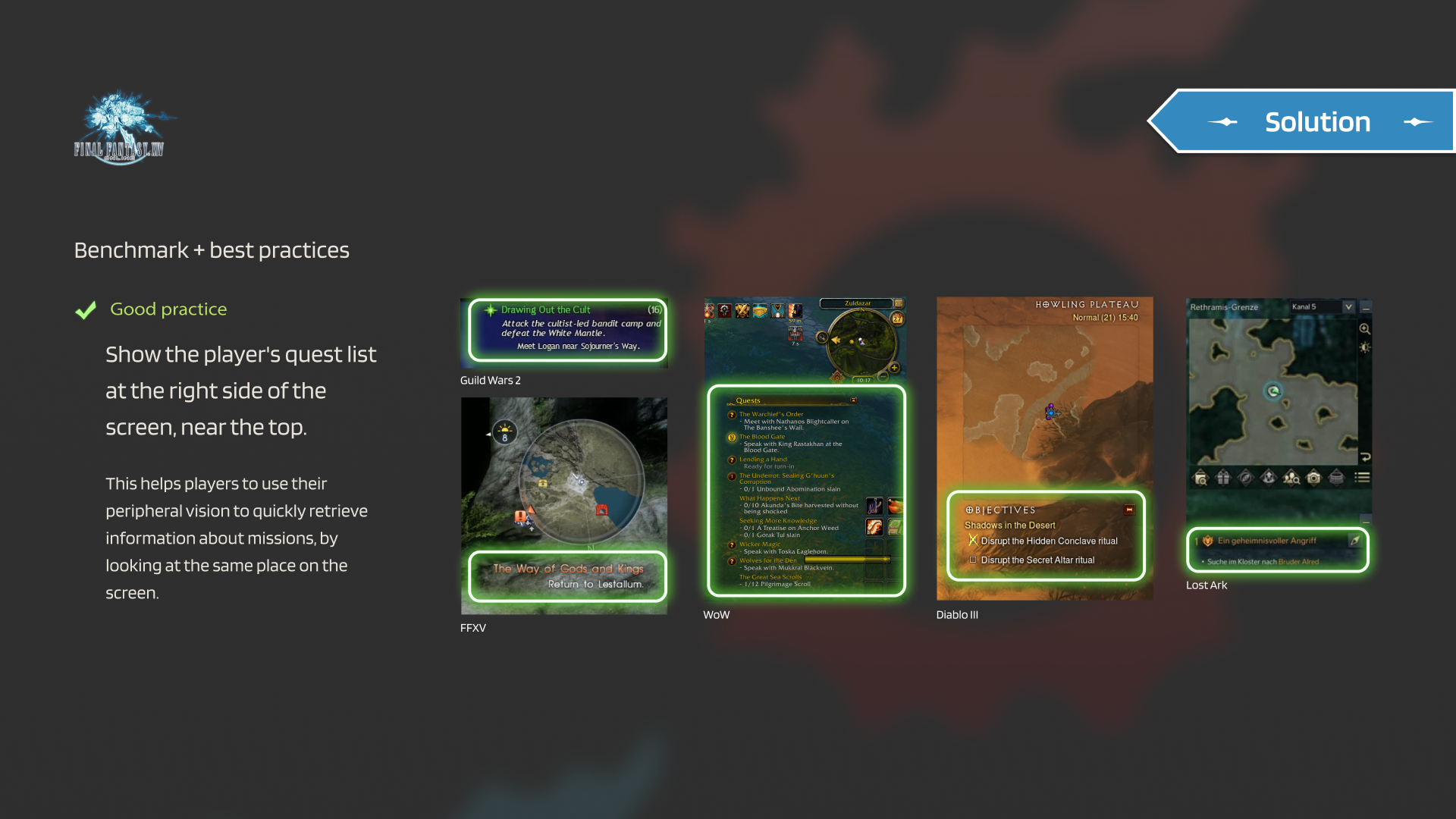
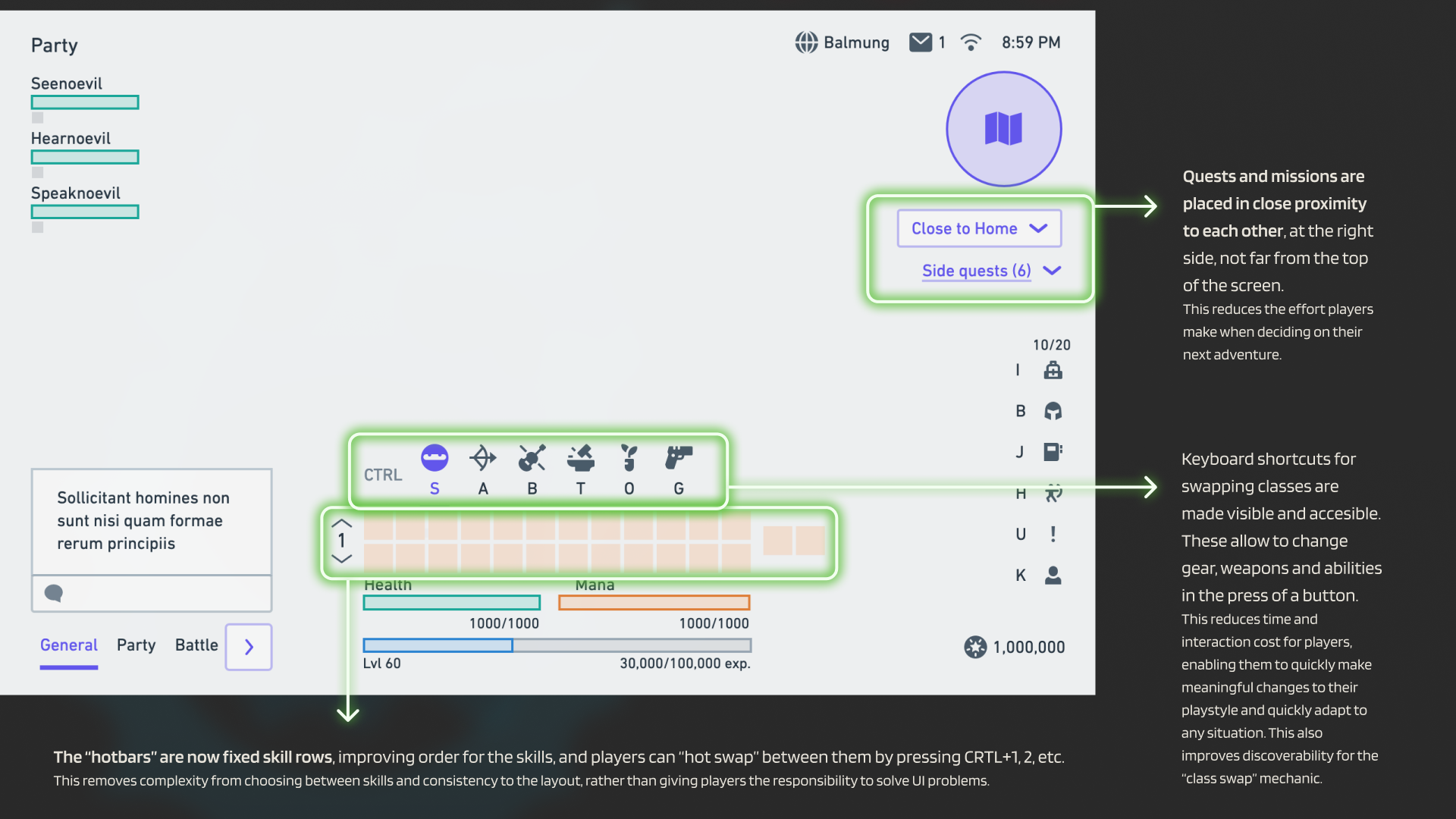
- 01Show the quest list at the top-right. Players use peripheral vision to retrieve mission info; a fixed anchor wins over a flexible position.
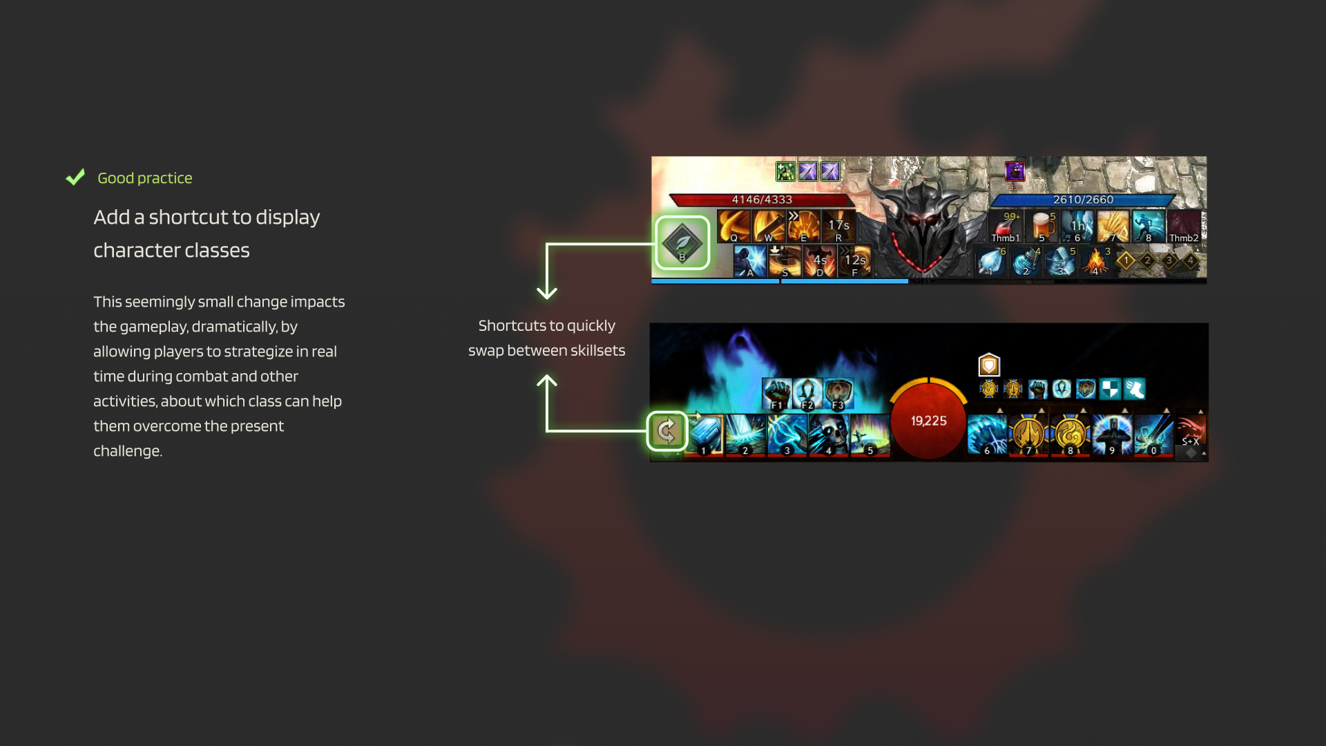
- 02Add a class-swap shortcut on screen. Surface the most strategic interaction — hiding it in a menu hides the gameplay.
- 03Cluster quests & duties together. Reduce the cost of deciding "what to do next" — proximity is the cheapest pattern there is.
- 04Keep keyboard shortcuts visible. Discoverability for the swap mechanic; one keystroke beats a menu dive.
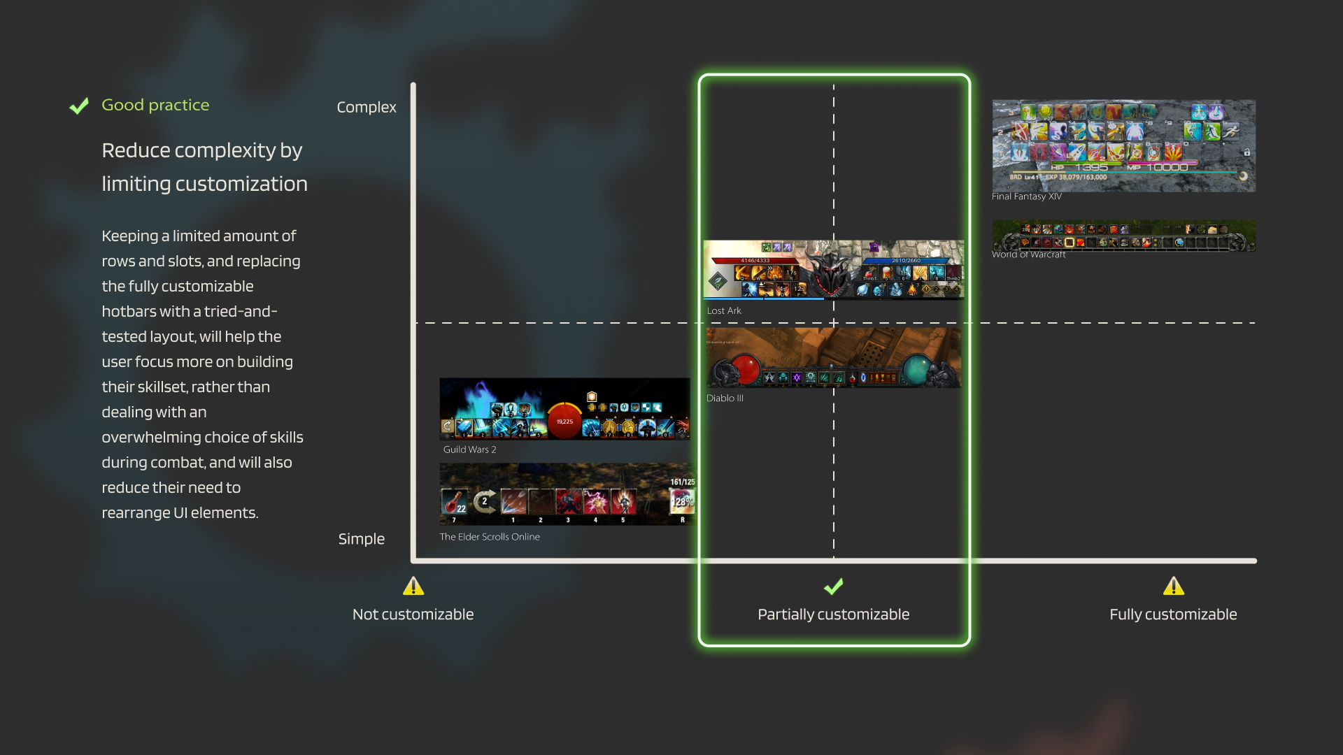
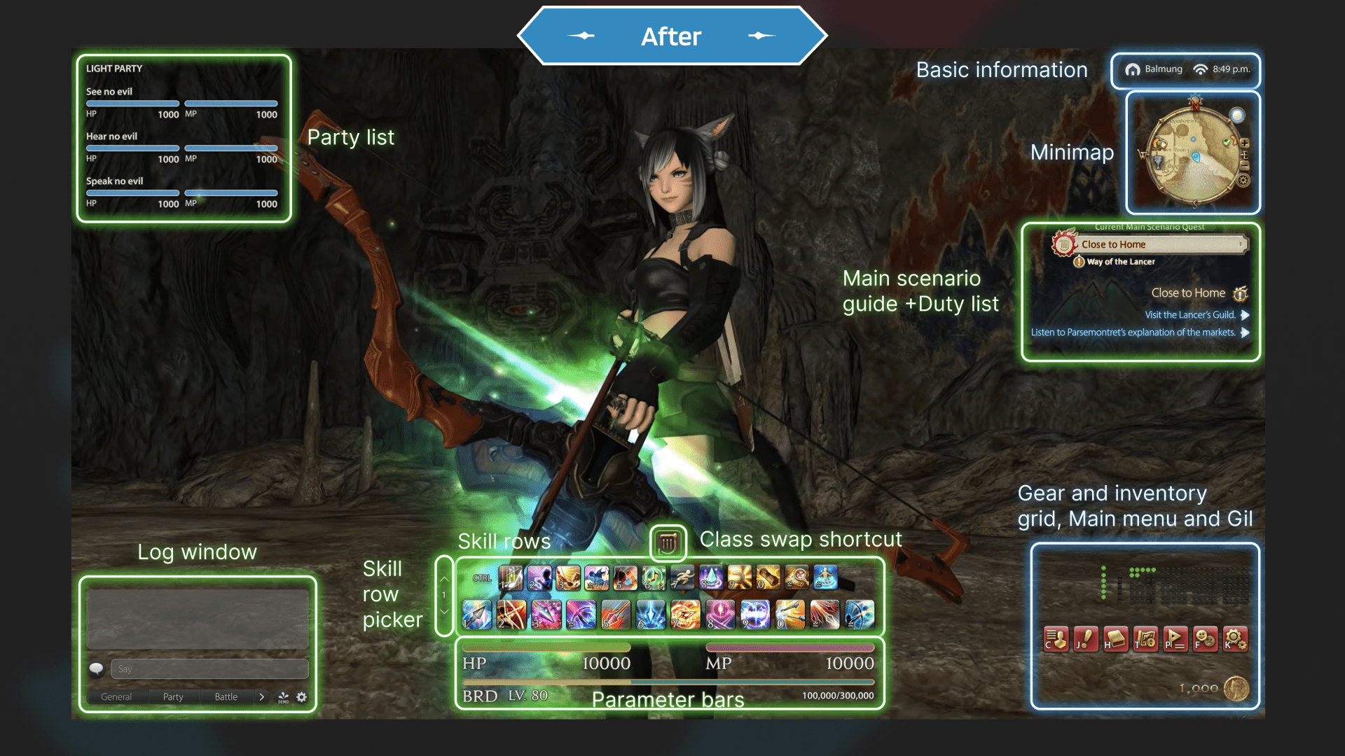
- 05Replace hotbars with immutable rows. Three rows, hot-swapped with CTRL+1/2/3. Less customisation, more focus.
A calmer screen.
The new HUD trades twelve hotbars for three immutable skill rows hot-swapped with CTRL+1/2/3. The quest list permanently lives at the top-right. A class-swap shortcut appears, finally, on screen.
The cost: less customisation. The gain: a screen a new player can read in three seconds.
What I took with me.
Game UX taught me to read every pixel. Every glyph on a HUD is competing for attention, and the designer's job is to spend that attention deliberately — same instinct I bring to the chat surface inside Concierge today.
Letting power-users customise everything is generous. Pretending the default doesn't matter is a design choice that quietly costs you everyone else.