Payment checkout — redesigned at scale, live.
Redesigning the most critical step in the airline booking funnel — at scale, across markets, with zero margin for error.
The final gate before a booking becomes revenue.
LATAM's payment page was the final conversion gate for millions of booking journeys across Latin America. The existing flow was generating friction, errors, and customer claims.
A full redesign was needed — one that could roll out safely without disrupting one of the highest-traffic checkout flows in the region.
Two journeys, one payment page.
Desktop and mobile web — app and assisted-sales flows were out of scope. Within that surface, two distinct journeys needed to work end to end: regular checkout and miles redemption.
One page, not four windows.
The old flow spread payment across four windows: a main window just to read which payment method was selected, plus three modals stacked on top of it — one to select a payment method, one to add a new one, and one to fill out billing information. Every step meant losing the context of the one before it.
The redesign collapsed all four into a single page, with what's selected and what's available made unambiguous at a glance instead of inferred window by window.
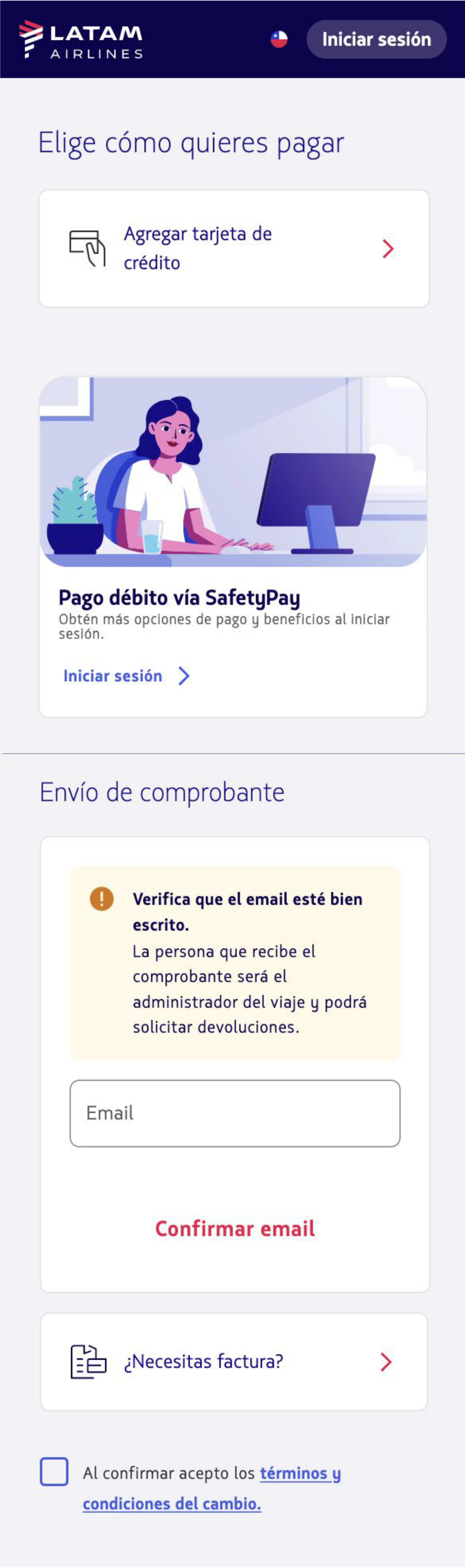
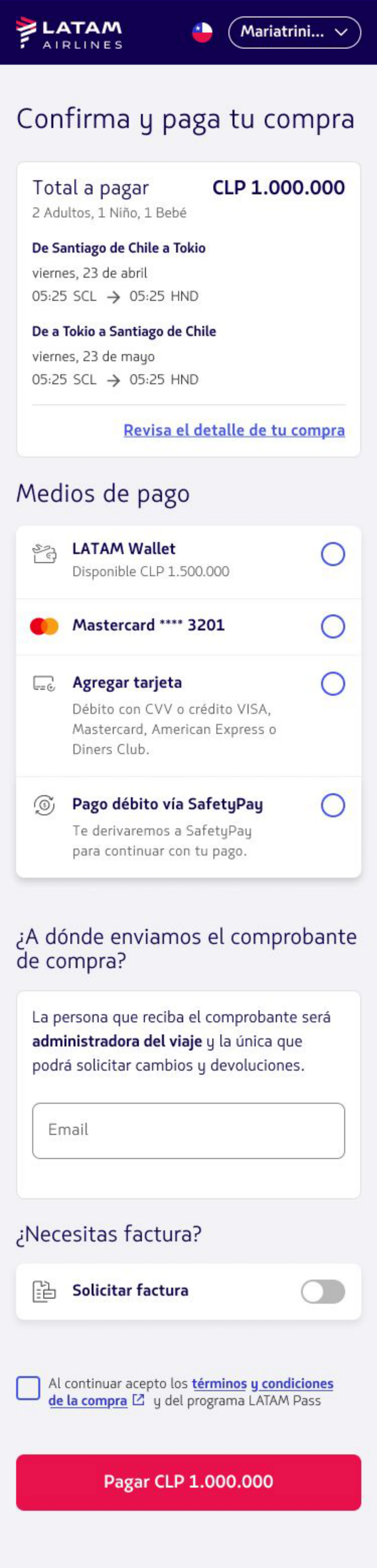
- 01Single page — one main window plus three modals (select, add, bill) collapsed into one flow
- 02Payment-method clarity — selected vs. available states redesigned to remove ambiguity
- 03Time on task — down from 6 to 4 minutes
- 04One component, company-wide — a single payment-method component with variants, reused across web and mobile touchpoints
Rather than solve this once for this page, I designed it as a single custom component with variants per payment method — the same building block reused across every online payment touchpoint, web and mobile, replacing whatever each product had improvised on its own. The company-wide rollout took a year and a half, reached 7 other digital products, and each one saw its own conversion rate improve.
Four windows, one page. Start to finish, no context lost.
Ship it like a live experiment.
A phased rollout strategy treated the release as a live experiment — scaling traffic per market only when conversion data confirmed improvement, and pulling back when issues emerged.
The regular flow took six iterations across three weeks. Starting at −10% with 10% of traffic and landing at +13% at full traffic wasn't turbulence — it was the process working exactly as designed. We fixed debit offsite issues mid-flight and kept moving.
The miles redemption flow followed a cleaner path across four markets, closing at +3% improvement at full rollout.
Scale traffic when the data agrees. Pull back when it doesn't.
Up at full traffic, on both flows.
Beyond conversion: faster delivery and fewer inter-team PR review cycles, a byproduct of a rollout process that surfaced issues early instead of at launch.
Coordination as design work.
At this scale, redesign is also a coordination problem. Aligning product, engineering, QA, and market operations across multiple countries — while maintaining rollout discipline — demands as much design thinking as the interface itself.
The interface was the easy part. Holding the rollout together wasn't.