Continuous improvement of access to Concierge.
LATAM's in-app AI travel assistant lived behind one card on Home — and almost nobody tapped it. This is how a content-and-accessibility pass, shipped without a single new component, multiplied access and first messages.
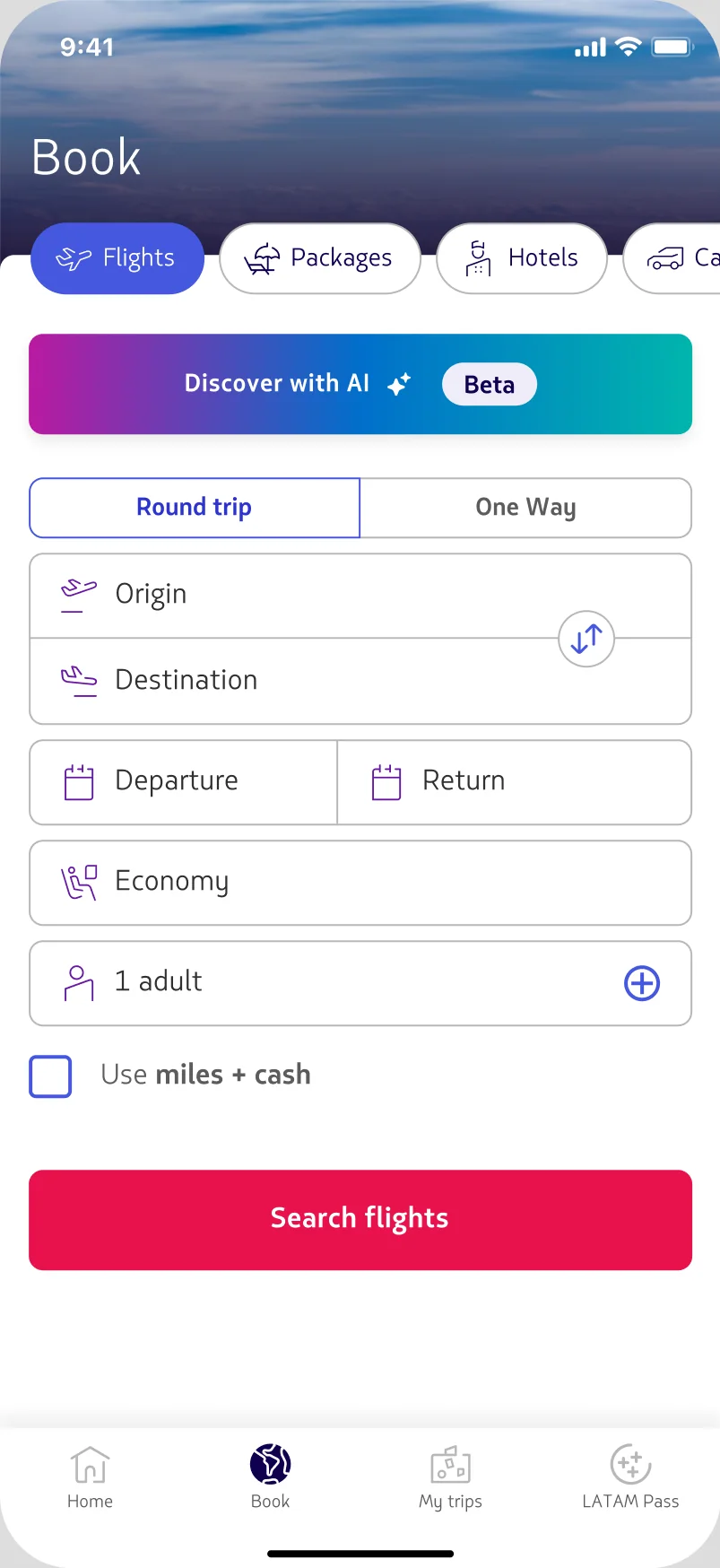
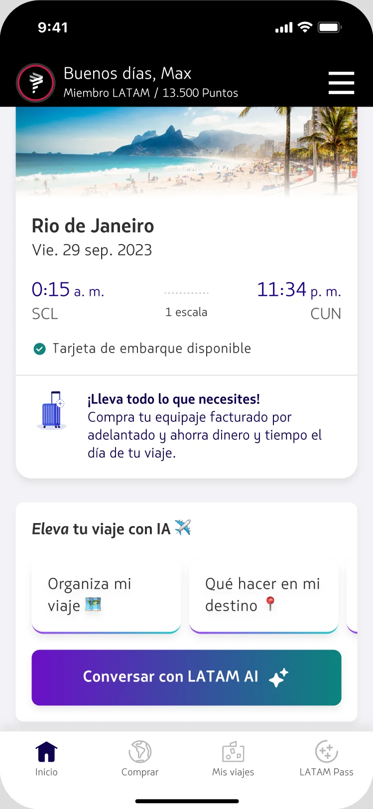
The card was the entire funnel.
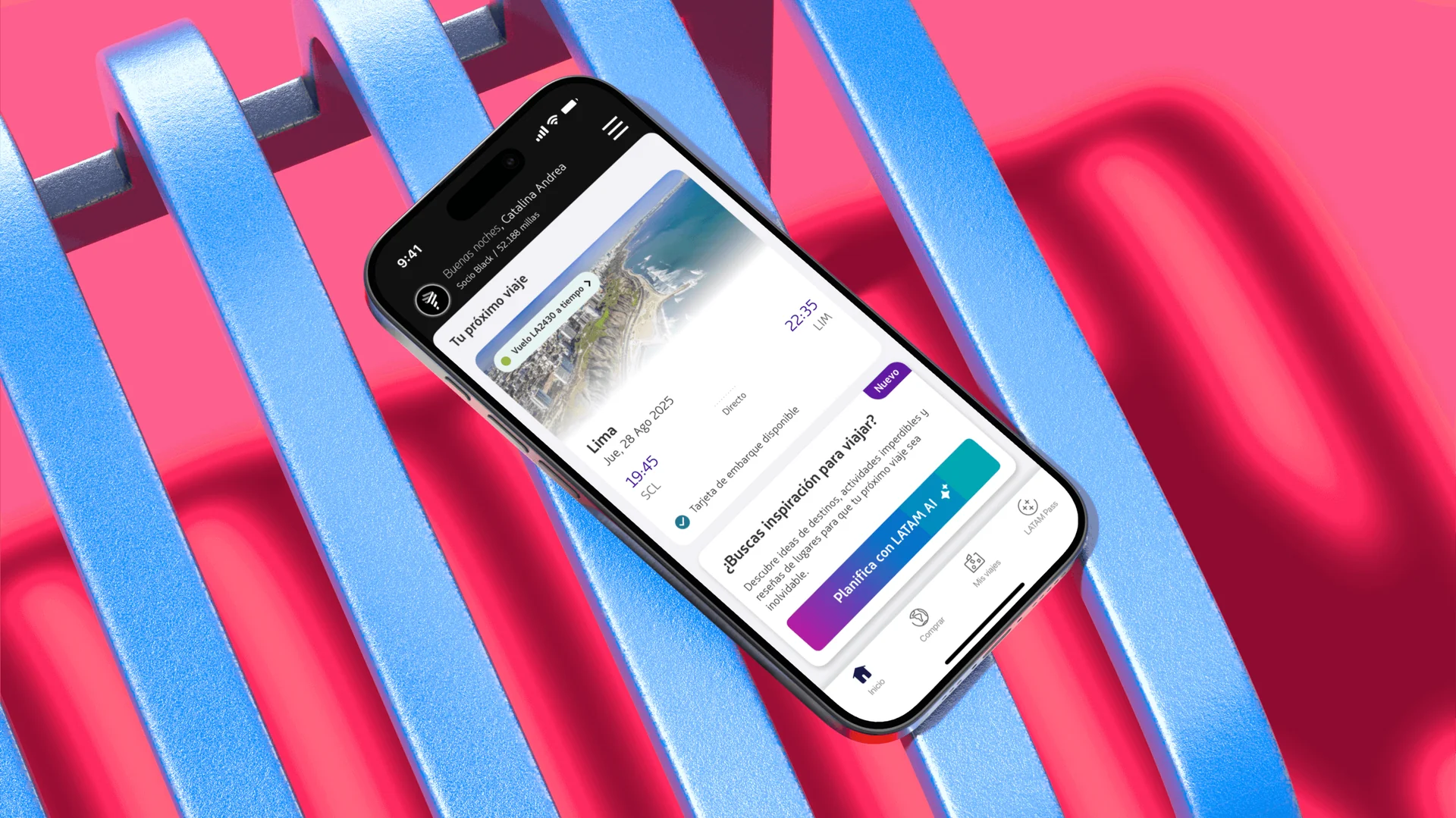
Concierge — LATAM Airlines' in-app AI travel assistant — lived behind a single card on the Home tab. One button on that card was the whole way in.
Only 0.5% of logged-in users were tapping it. The worst-performing reference banner sitting beside it was still clearing 10%. That gap told us the ceiling wasn't the assistant — it was the invitation.
So the hypothesis stayed deliberately small: improve the card, lift the access rate. The constraint was real — six weeks, no new components, minimal engineering. Whatever shipped had to be words and pixels on a card that already existed.
Rewrite the message, raise the contrast.
Three moves, each picked because it needed no new component. A content pass on every card's title, description and CTA — drafted with an internal content assistant trained on our voice & tone, a golden set of vetted responses, and outside content-design references. A copy change on the Shop > Flights access button. And an accessibility pass on the button itself, whose tri-colour gradient was failing AA contrast for the label sitting on top of it.
Smaller surface. Less risk. More leverage.
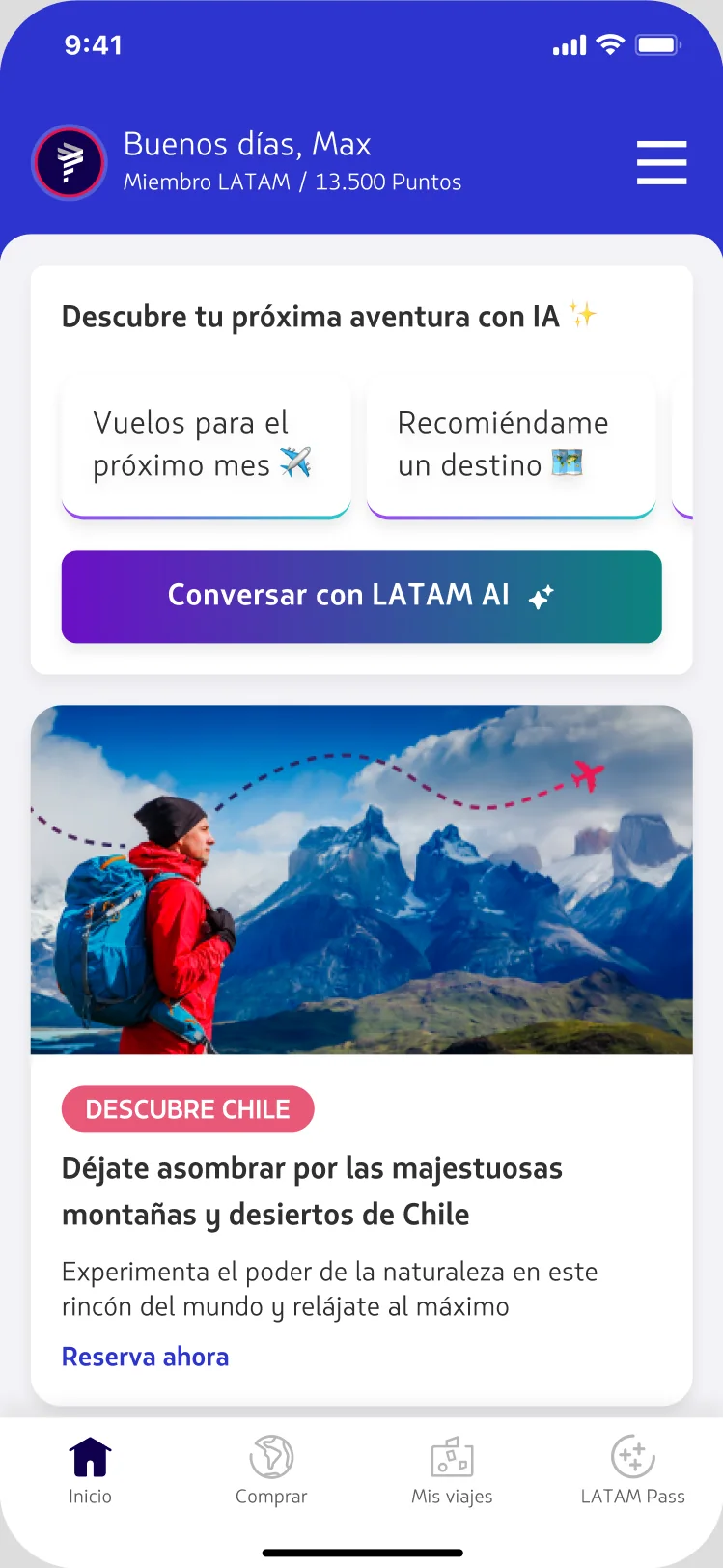
"¿Buscas inspiración para viajar?"
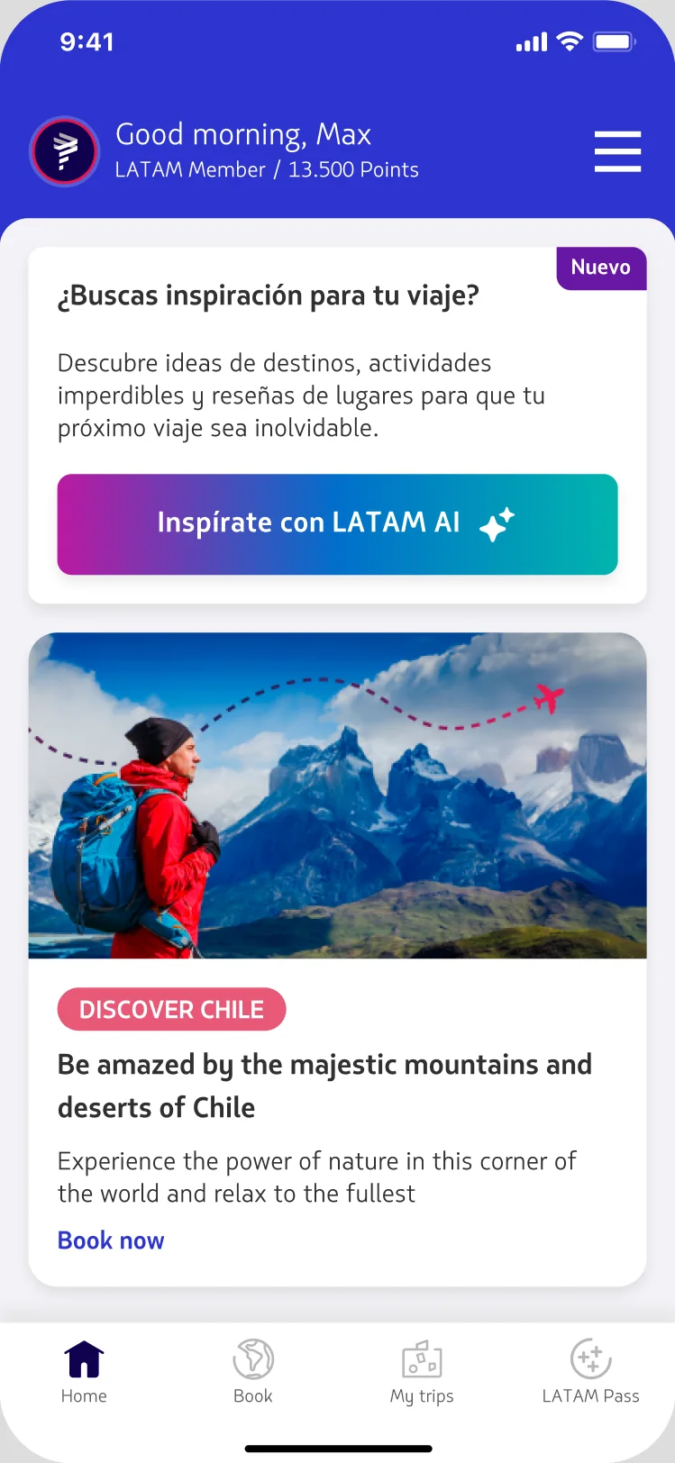
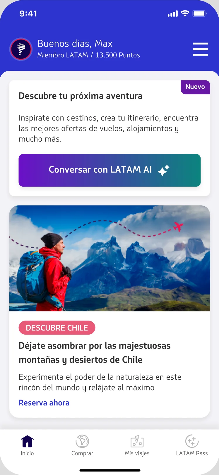
"Descubre tu próxima aventura"
"¿Buscas inspiración para viajar?"
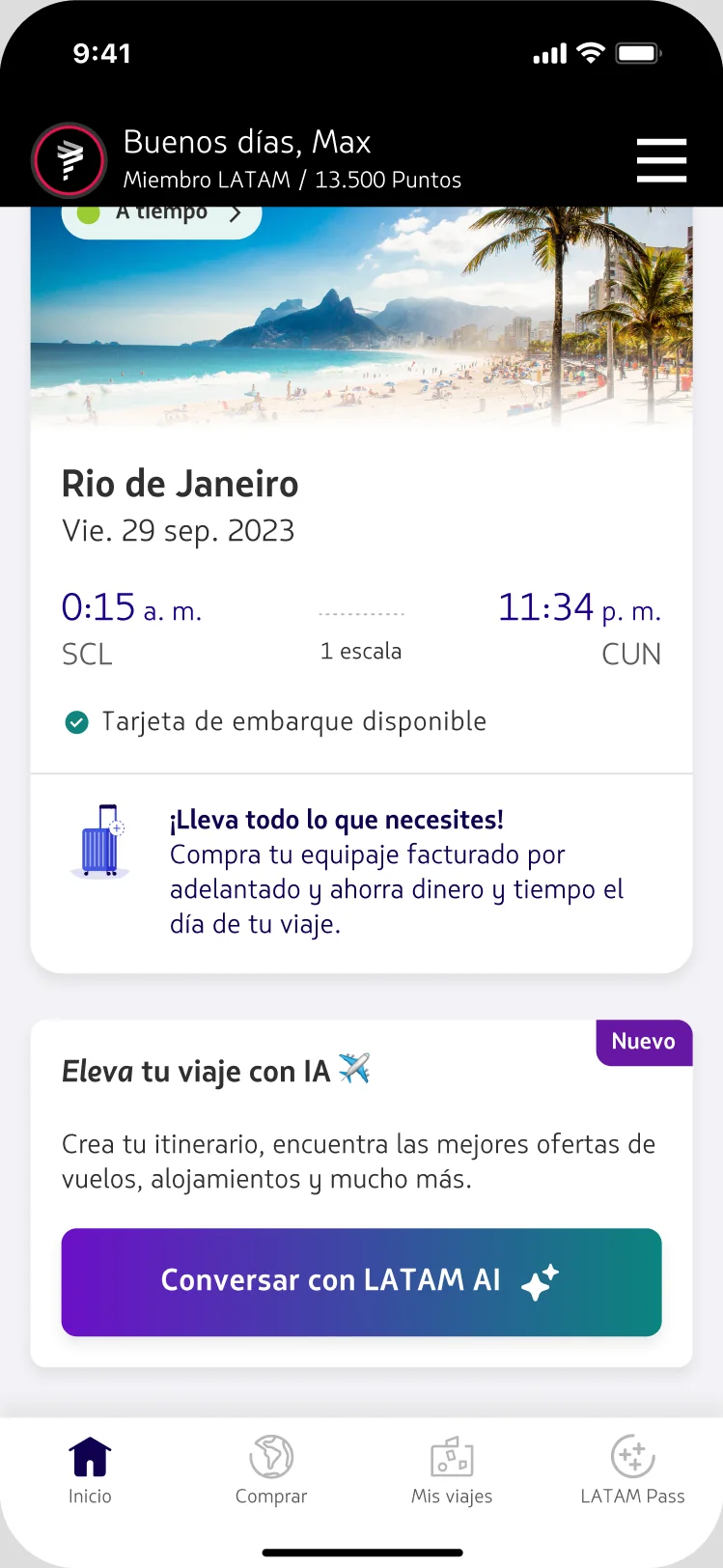
"Eleva tu viaje con IA ✈"
"Descubre ideas de destinos, actividades imperdibles y reseñas de lugares…"
"Inspírate con destinos, crea tu itinerario, encuentra ofertas de vuelos y alojamientos."
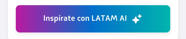
"Inspírate con LATAM AI" · "Descubre con IA"
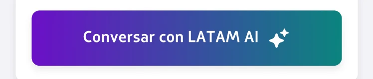
"Conversa con LATAM AI" · "Buscar vuelos con LATAM AI"
Accessibility · contrast pass
The button's label sat on a three-colour gradient that ran from magenta through a light mid-blue. Over those light tones, white text measured 2.8 : 1 — under the WCAG AA minimum. Re-anchoring it to a two-stop gradient — Purple 700 into Teal 500 — kept the brand energy and pushed contrast to 4.9 : 1.
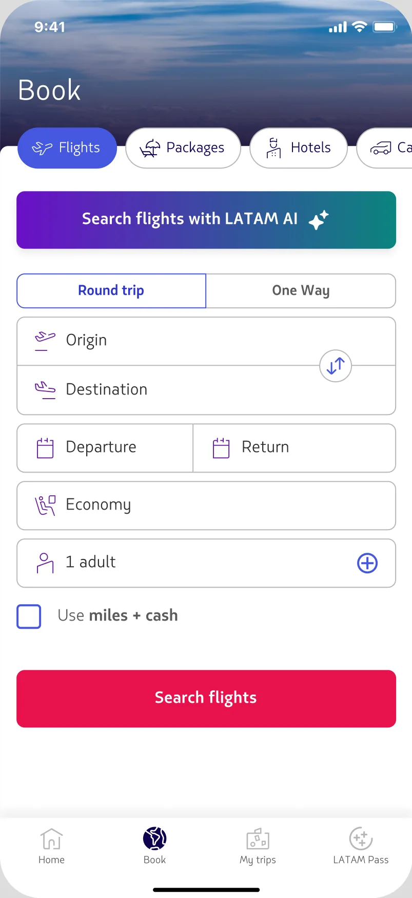
Shop > Flights · the biggest single lift
On the flight-search surface, the access button said only "Discover with AI." We made it say exactly what it does for someone already booking a flight — "Buscar vuelos con LATAM AI." Same button, same place, one honest line of copy.
Replace the description with quick replies.
Inside the chat, suggested prompts were already driving 40–50% of all interactions. So we asked a sharper question: what if the card showed those quick replies instead of a paragraph of description? Suggestions don't just save typing — they teach people what Concierge can actually do.
We seeded each set from the top user intents in chat — mined in BigQuery — and branched the content by state: no upcoming trip, an upcoming trip, and the 48-hour pre-trip window.
What shipped.
Every move ran as a controlled experiment, measured on access rate and first-message rate, split by user state.
The 48-hour pre-trip window was the one inconclusive cell — it's being re-tested with a suggestions-only variant. Everywhere else, the treatment won and was promoted to default.
Content & accessibility, promoted to default. Suggestions set the foundation for the next big bet.